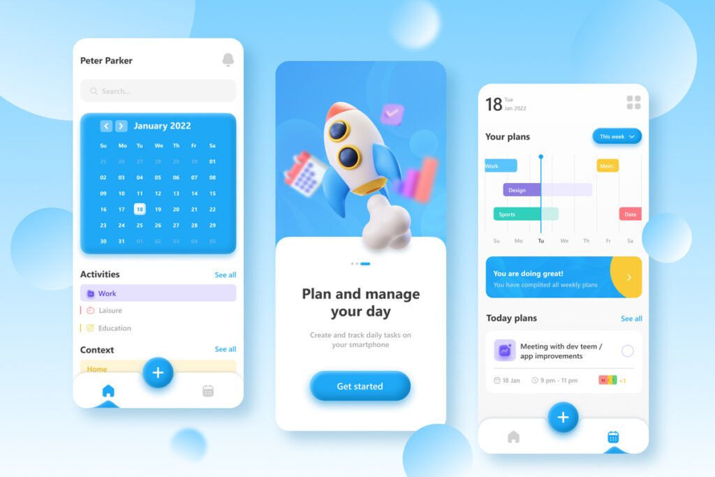
In the ever-evolving landscape of digital design, a new aesthetic trend is making waves: Claymorphism. This design approach brings real-world clay-like materials into the digital space, creating interfaces that feel tangible, warm, and surprisingly human.
The Evolution of Digital Design
The journey to Claymorphism is a story of design evolution. After the reign of flat design, we saw the emergence of Neumorphism, which, while innovative, struggled to gain widespread adoption due to its visual limitations and implementation challenges. However, the design community’s desire for depth and dimension in interfaces didn’t diminish – it simply needed a different expression.
What Makes Claymorphism Special?
Claymorphism stands out for several key characteristics:
- Soft, Inflated Appearance: The design elements appear as if they’re made from soft clay, with gentle curves and rounded edges that create a friendly, approachable aesthetic.
- Dimensional Depth: Unlike its predecessor Neumorphism, Claymorphism achieves depth through a combination of inner and outer shadows that create a more pronounced 3D effect.
- Emotional Connection: The clay-like aesthetics often evoke nostalgic feelings of childhood, particularly reminiscent of stop-motion animation, creating a warm and safe emotional response.
Technical Implementation
Creating the Claymorphic effect involves several key components:
- Shadow Work: The effect combines three main shadow elements:
- An outer shadow for depth against the background
- Two inner shadows: a lighter one top-left and a darker one bottom-right
2. Shape Construction: The basic process involves:
- Starting with a rectangle or square
- Applying significant corner rounding (usually beyond 50%)
- Using curved edges to create the soft, inflated appearance
CSS Implementation
Here’s how to achieve the Claymorphism effect in CSS:
.clay {
  background: var(--clay-background, rgba(0, 0, 0, 0.005));
  border-radius: var(--clay-border-radius, 32px);
  box-shadow:
    var(--clay-shadow-outset, 8px 8px 16px 0 rgba(0, 0, 0, 0.25)),
    inset var(--clay-shadow-inset-primary, -8px -8px 12px 0 rgba(0, 0, 0, 0.25)),
    inset var(--clay-shadow-inset-secondary, 8px 8px 12px 0 rgba(255, 255, 255, 0.4));
}
Real-World Applications
Claymorphism is already making its mark across various digital platforms:
- Banking Websites: Australia’s largest bank has incorporated clay-like aesthetics in their marketing and website design
- Gaming: Popular games like Fall Guys utilize clay-like characters and elements
- NFT Artwork: The style has gained significant traction in the NFT space
- Virtual and Augmented Reality: The tangible nature of Claymorphism makes it particularly suitable for VR and AR interfaces
Why It Works
The success of Claymorphism can be attributed to several factors:
- Processing Speed: The tangible, almost real appearance allows our brains to process interfaces more quickly
- Emotional Appeal: The soft, friendly appearance creates a welcoming user experience
- Versatility: It works well in both light and dark modes (when properly implemented)
- Modern Integration: It can be combined with other design trends like Glassmorphism for fresh, interesting results
Looking Forward
As we move further into the era of virtual and augmented reality, Claymorphism’s tangible nature positions it well for future applications. Its ability to create interfaces that feel almost real makes it particularly suitable for immersive digital experiences.
Conclusion
Claymorphism represents more than just another design trend – it’s a response to our desire for more human, tangible digital experiences. In a world that’s increasingly digital, this design approach brings a touch of warmth and familiarity to our screens. Whether it’s through banking apps, games, or virtual reality interfaces, Claymorphism is helping bridge the gap between the digital and physical worlds, one soft, clay-like element at a time.
